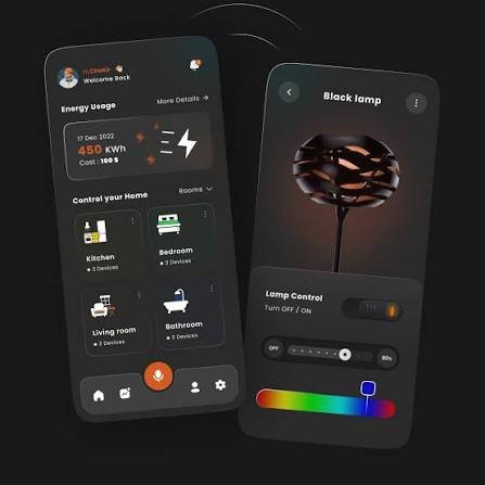
A good mobile app design is about more than making screens look attractive. It determines how easily people can find information, complete tasks, understand features, and recover when something goes wrong. A visually impressive app can still fail if users cannot figure out what to do next.
Effective design brings together layout, navigation, typography, colors, interaction patterns, accessibility, and usability. It also considers the limitations of mobile devices, including smaller screens, touch controls, different screen sizes, and varying network conditions.
Whether you’re planning a new app, redesigning an existing product, or learning UI/UX design, understanding the fundamentals can help you create an experience that feels simple rather than confusing.
What Is Mobile App Design?
Mobile app design is the process of planning and creating the visual interface and user experience of an application designed for smartphones or tablets.
It usually includes two closely connected areas:
- UI design: The visual side of the app, including buttons, colors, typography, icons, cards, menus, spacing, and screen layouts.
- UX design: The way users move through the app, complete tasks, understand information, and interact with features.
For example, imagine a food delivery application. UI design determines how the restaurant cards, menus, buttons, and checkout screen look. UX design determines how easily someone can search for a restaurant, choose food, add an address, and place an order.
These areas overlap, but they solve different problems.
A beautiful interface with confusing navigation creates frustration. A highly usable app with a poorly organized or inconsistent interface can also feel difficult to trust. Strong products pay attention to both.
Why Mobile App Design Matters
People generally expect mobile apps to respond quickly and make common tasks easy. On a small screen, unnecessary complexity becomes especially noticeable.
Good design can help users:
- Understand an app quickly
- Find important features
- Complete tasks with fewer steps
- Avoid accidental actions
- Read content comfortably
- Recover from mistakes
- Build confidence in the product
Consider a banking app. Users may want to check a balance, transfer money, or review a transaction. These tasks should not require users to explore several unrelated screens before finding the right option.
The best interface often feels almost obvious. Users do not have to think about the design itself; they can focus on what they came to accomplish.
Key Elements of Effective Mobile App Design
1. Simple Navigation
Navigation should reflect what users actually need to do.
For apps with several major sections, a bottom navigation bar can make frequently used destinations easy to reach. Other apps may benefit from tabs, search, menus, or task-specific navigation.
Avoid creating too many competing navigation options. If everything looks equally important, users may struggle to understand where they should start.
2. Clear Visual Hierarchy
Visual hierarchy tells users what deserves attention first.
You can create hierarchy through:
- Font size
- Font weight
- Spacing
- Position
- Contrast
- Color
- Grouping
For instance, a product page might place the product name above supporting details, followed by the price and a prominent purchase button.
The hierarchy should match the user’s priorities rather than simply making certain elements visually large.
3. Touch-Friendly Controls
Mobile users interact primarily through touch, so controls need enough space to be tapped comfortably.
Buttons and interactive elements that are too small can cause accidental taps and frustration. Designers should also consider that people may use an app with one hand, while walking, or under less-than-ideal conditions.
Spacing between interactive controls matters too. Two buttons placed too close together can make mistakes more likely.
4. Readable Typography
Text should remain comfortable to read on smaller displays.
Choose typefaces that work well at different sizes and maintain enough contrast between text and its background. Avoid filling every screen with dense paragraphs.
Good typography also establishes hierarchy. Headings, labels, supporting text, and buttons should look different enough that users can quickly understand their roles.
5. Consistent Design
Consistency reduces the amount of thinking users need to do.
If a button performs an action on one screen, a similar button should generally behave the same way elsewhere. Icons, spacing, colors, terminology, and interaction patterns should also follow a consistent system.
A design system can help teams maintain this consistency as an app grows.
6. Feedback After User Actions
Users should know when their actions have been recognized.
For example, after submitting a form, the app might display a confirmation message. When loading information, a progress indicator can explain why the screen has not changed yet.
Feedback is particularly important for actions that take time or affect important information.
Silence creates uncertainty. Users may wonder whether they tapped the button, whether the app is loading, or whether they should try again.
Mobile App Design Process: Step by Step
Step 1: Understand the User
Before designing screens, identify who will use the app and what they are trying to accomplish.
Ask questions such as:
- Who is the target user?
- What problem does the app solve?
- What is the most common task?
- What information does the user need?
- What could make the task difficult?
User research does not always require a large study. Interviews, customer feedback, support requests, analytics, and usability tests can reveal valuable problems.
Step 2: Define the Core User Flows
Map the major journeys users will take through the app.
For a shopping app, a basic flow might look like:
Search → Product → Add to Cart → Checkout → Confirmation
This helps identify unnecessary screens and confusing transitions before significant visual design work begins.
Step 3: Create Wireframes
Wireframes provide a basic structure for each screen.
At this stage, focus on:
- Content placement
- Navigation
- Information hierarchy
- Main actions
- Screen-to-screen relationships
You do not need polished colors and graphics yet. The goal is to solve structural problems early, when they are easier and cheaper to fix.
Step 4: Build the Visual Design
Once the structure works, introduce the visual language.
This can include:
- Brand colors
- Typography
- Icons
- Images
- Buttons
- Cards
- Form fields
- Illustrations
- Spacing rules
A visual style should support usability rather than compete with it.
Step 5: Create a Prototype
A prototype connects screens so people can interact with the proposed experience.
Prototypes are useful because static designs can hide problems. Someone may understand a screen while reviewing it in a design tool but become confused when actually navigating the flow.
Step 6: Test With Real Users
Ask people who resemble the target audience to perform realistic tasks.
Instead of asking, “Do you like this design?” give them a task such as:
“Find a product under $50 and add it to your cart.”
Then observe what happens.
Look for hesitation, unexpected taps, backtracking, misunderstandings, and questions. These behaviors often reveal more than opinions about colors or visual style.
Step 7: Refine and Repeat
Design is rarely a one-pass process.
Fix the most important usability problems first. Then test the revised experience again.
Small changes can make a major difference. A clearer label, better grouping, or simpler checkout process may be more valuable than adding another visual effect.
Common Mobile App Design Mistakes
Trying to Put Everything on One Screen
A screen overloaded with buttons, text, images, and menus becomes difficult to scan.
Prioritize the primary task and move secondary information into appropriate locations.
Designing for Appearance Alone
A visually attractive interface does not automatically provide a good user experience.
Always ask whether users can understand the screen and complete the intended task.
Ignoring Different Screen Sizes
An interface that looks perfect on one phone may feel cramped or poorly balanced on another.
Responsive layouts, flexible spacing, and careful testing across devices can prevent these problems.
Using Icons Without Clear Meaning
An unfamiliar icon can force users to guess.
When an action is important or ambiguous, a text label can provide useful context. Familiar conventions are generally safer than inventing new symbols.
Making Errors Difficult to Recover From
People make mistakes. They may delete something accidentally, enter invalid information, or navigate to the wrong screen.
Useful error handling explains what happened and, when possible, provides a clear way to correct it.
Ignoring Accessibility
Accessibility should be considered during the design process rather than added at the end.
Think about readable text, sufficient contrast, touch targets, screen readers, motion sensitivity, and users who interact with devices in different ways.
An accessible interface is often easier for everyone to use.
Expert Tips for Better Mobile App Design
Design Around the Most Important Task
Start with the action that matters most to your users. If an app solves one primary problem, that task should be easy to discover.
Reduce Unnecessary Decisions
Every extra choice can increase cognitive effort.
If a reasonable default exists, consider providing it rather than making users configure everything themselves.
Keep Important Actions Predictable
Users should not have to wonder what will happen after pressing a button.
Labels such as “Save Changes,” “Continue,” or “Place Order” communicate more clearly than vague labels like “Next” when the context is not obvious.
Use Empty States Productively
An empty screen does not have to be a dead end.
For example, an empty favorites page could explain that no items have been saved and provide a clear way to discover products.
Design for Slow Connections
Not every user will have a fast connection.
Consider loading states, cached information, graceful failures, and useful offline behavior where appropriate.
Test the Entire Experience
Do not test only individual screens.
A screen may look excellent by itself but create problems when users move from one screen to another. Test complete journeys from beginning to end.
Mobile App Design Tools
Different tools serve different stages of the process.
Design teams commonly use interface-design and prototyping software to create wireframes, visual layouts, interactive prototypes, and reusable components.
When choosing a tool, consider:
- Collaboration features
- Prototyping capabilities
- Design-system support
- Developer handoff
- Version history
- Team workflow
- Integration with existing development tools
The specific software matters less than having a clear design process. A sophisticated tool cannot compensate for unclear user flows or weak usability testing.
Mobile App Design vs. Mobile App Development
Design and development are connected but different disciplines.
Design focuses on what users see and how they interact with the product.
Development turns those designs into functional software.
Developers must consider technical constraints such as operating-system behavior, performance, APIs, databases, security, device compatibility, and network conditions.
Designers should therefore work with developers early instead of treating development as something that happens after the design is completely finished.
Early collaboration can expose technical limitations before they become expensive redesigns.
Frequently Asked Questions
What is mobile app design?
Mobile app design is the process of creating an application’s interface and user experience for smartphones or tablets. It includes layout, navigation, typography, interactions, accessibility, and visual styling.
How do I start mobile app design?
Start by defining the problem your app solves and understanding its users. Then map the main user flows, create wireframes, develop the visual design, prototype the experience, and test it with users.
What makes a mobile app design good?
A good design makes important tasks clear and easy while maintaining consistency, readability, accessibility, and predictable interactions. Visual appearance matters, but usability should remain central.
Is UI or UX more important?
Neither should be treated as completely separate from the other. UX helps determine whether the product is useful and easy to navigate, while UI communicates the experience visually and interactively. Strong apps need both.
How much does mobile app design cost?
There is no single price. Cost depends on the number of screens, complexity, research requirements, interaction design, branding, revisions, and whether a design system is needed. A simple utility app requires much less design work than a large platform with many user journeys.
Can one design work for both iPhone and Android?
A shared design system can support both platforms, but it should account for platform-specific conventions and behaviors. Simply copying one platform’s interface onto another can create usability issues.
Should I test my app before development?
Yes. Testing prototypes before development can reveal confusing navigation, unclear labels, and unnecessary steps before those problems become expensive to change.
What is the biggest mobile app design mistake?
One of the most common mistakes is prioritizing visual appearance over the user’s actual task. An interface can look polished while still being difficult to navigate or understand.
Final Thoughts
Successful mobile app design is less about adding visual decoration and more about removing friction.
Start with the user’s problem. Build clear flows around the tasks they need to complete. Use visual hierarchy, readable typography, consistent components, useful feedback, and accessible interactions. Then test the experience with real people and improve what causes confusion.
The strongest designs often feel simple because the difficult decisions were made behind the scenes. Users do not need to understand the design process. They simply need to know what to do, where to tap, and what will happen next.